
ART DIRECTION & BRAND IDENTITY Case Study
ALLIANCE OF HISPANIC SERVING RESEARCH UNIVERSITIES (HSRU)
NATIONAL COALITION INFRASTRUCTURE & MASTER BRAND
Building a national visual identity for an alliance of 20+ Tier-1 research universities is a massive challenge. Stepping into the Art Director role to take it on completely redefined my approach to visual communication.
I needed to establish a unified, authoritative presence that made sense to federal funding bodies and congressional leadership. At the same time, this brand had to seamlessly coexist alongside the diverse brands of our member universities and our own internal sub-brands.
The work showcased here represents my core visual communication philosophy. While my past roles focused heavily on single, specialized projects, this was my opportunity to step back and build the visual language for an entire national organization.
A PowerPoint slide used across Alliance stakeholder presentations utilizing my established master brand.
The HSRU Umbrella
The HSRU spearheads massive grant-funded projects in partnership with federal agencies and member universities. Because each project serves a completely different audience, they each need their own distinct “feel.”
Below is a look at how I built the visual identities for the Alliance's two flagship programs, creating a framework that balances their unique goals with the core HSRU brand as we continue to launch new initiatives.
THE ASCENDr INITIATIVE
Modular Sub-Brand
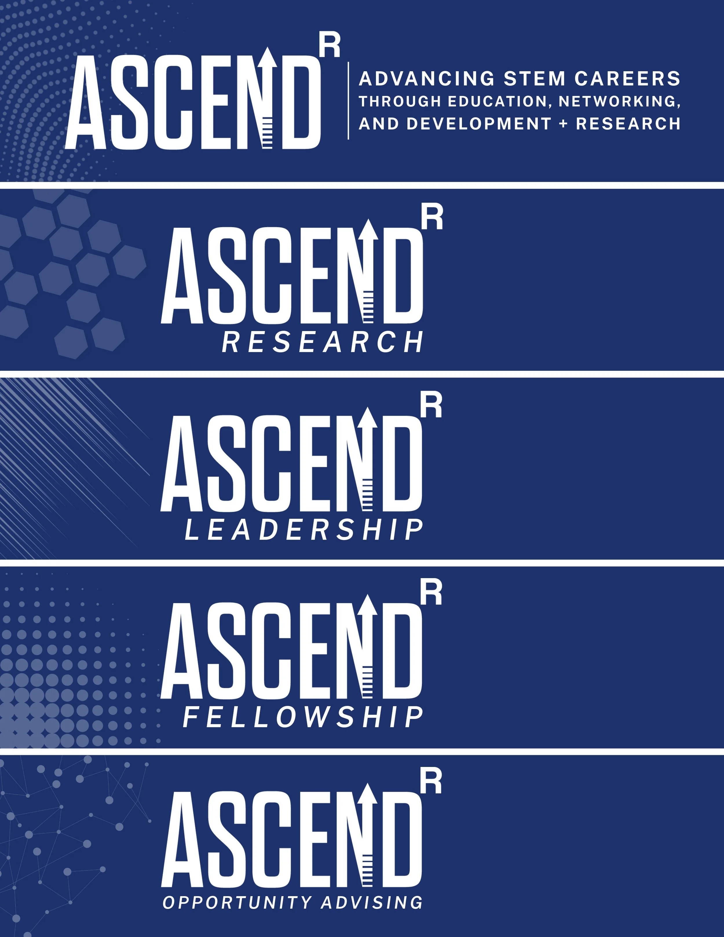
Stepping in to manage the Alliance's overall visual identity, my first major stress test was rolling out the brand architecture for the ASCENDr initiative—a massive Department of War STEM grant. The real challenge was figuring out how to organize a complex, federally funded initiative so each program felt connected as part of a single, unified brand while still retaining its own distinct identity.
To solve this, I built a modular sub-branding system anchored by a consistent main logo, which I inherited and refined. Each of the four ASCENDr tracks—Research, Leadership, Fellowship, and Opportunity Advising—stays visually connected to the core family but utilizes a unique geometric pattern, making it easy to immediately differentiate them across digital platforms and printed collateral.
HSRU/POSTDOC FELLOWSHIP
Direct Alliance Extension Program
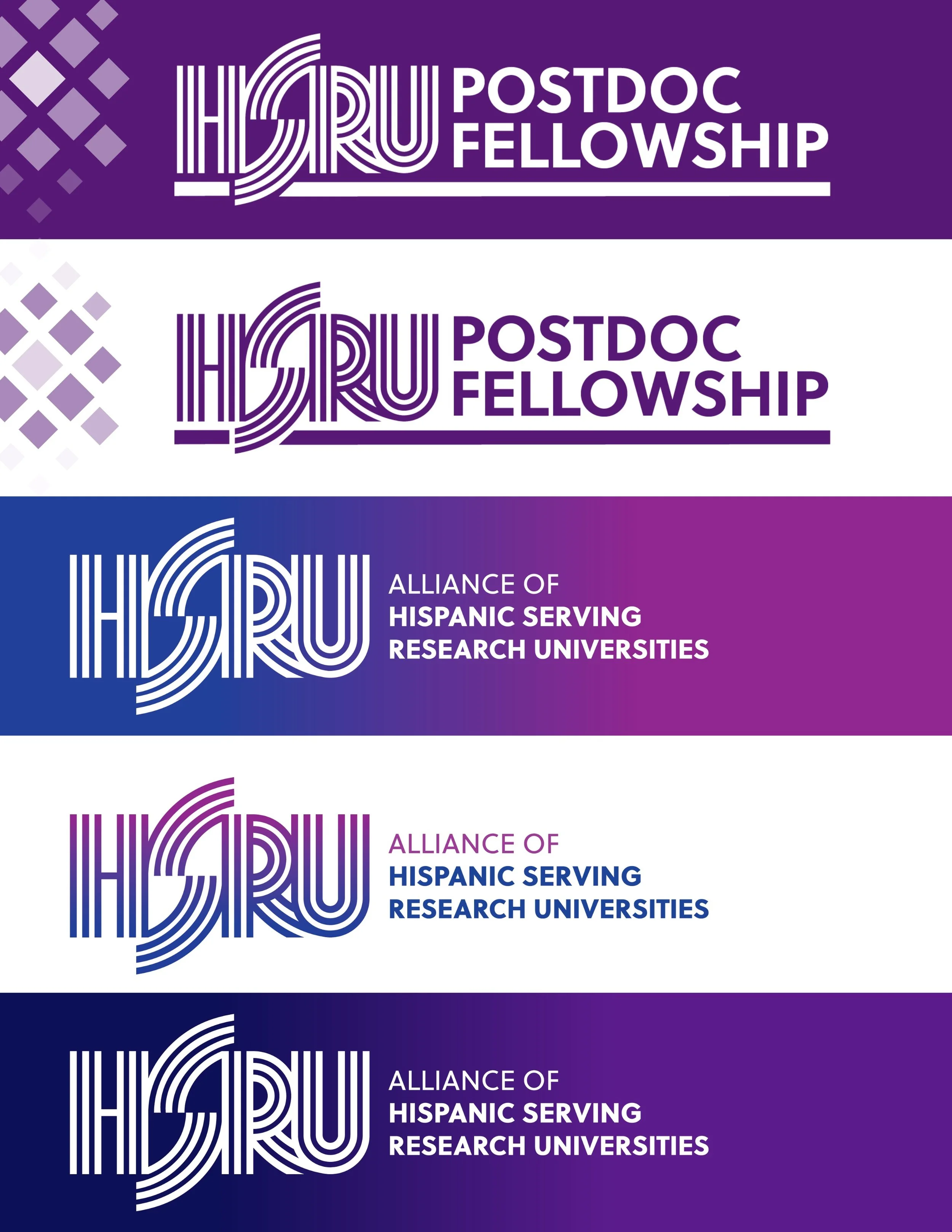
Inheriting work started by other designers and communication experts before I joined the Alliance, I needed to re-establish and streamline the foundational visual rules across all digital, print, and public touchpoints. The goal for the primary logo and typography was to convey institutional gravitas and professional reliability. I relied on a high-contrast palette specifically designed to stay sharp and readable across varied, co-branded environments.
By introducing stricter color rules, contrast-tested secondary palettes, and clear font guidelines, I made sure the HSRU team has the flexibility to represent the Alliance without ever fracturing our national identity.
Brands in Practice
SYSTEM ARCHITECTURE & PRODUCTION ASSETS
The ASCENDR brand in practice on the official HSRU website.

The updated HSRU Postdoctoral Fellowship program banner on the official HSRU Newsletter (Mailchimp).
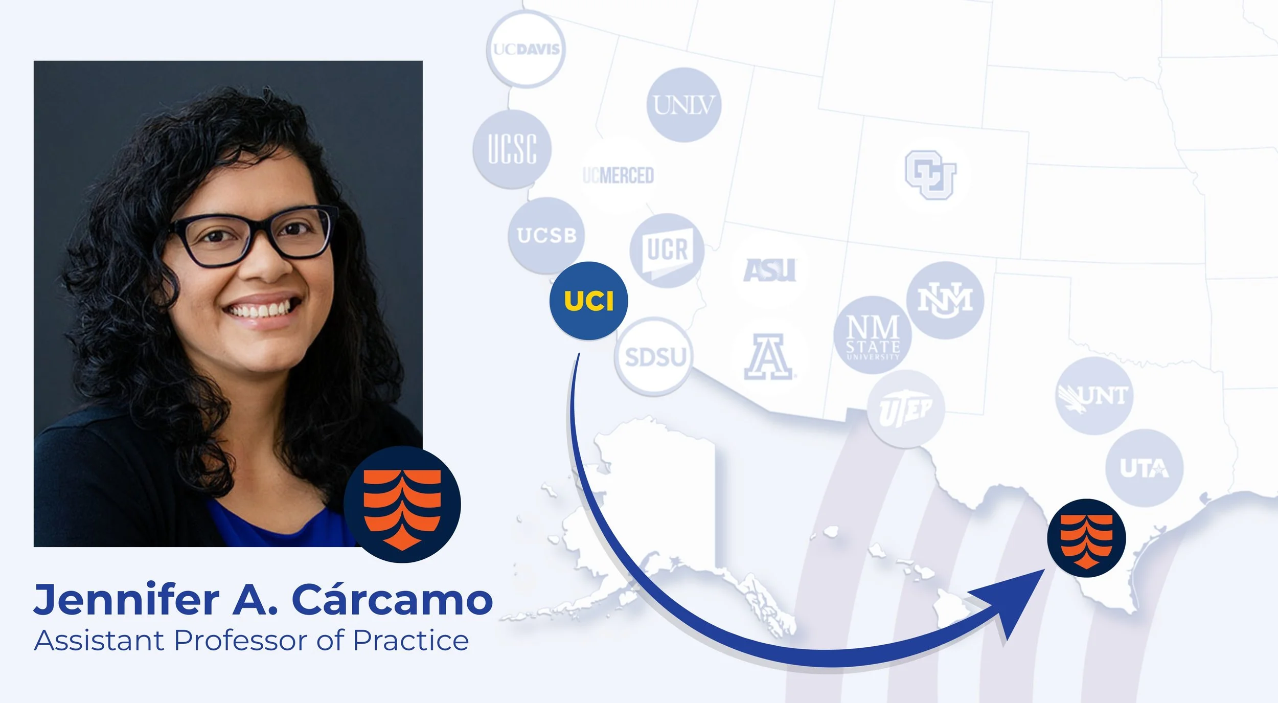
The HSRU brand in action of digital collateral that is part of an upcoming campaign.